There's been an update to Mania Drive. This one introduces a beginners storyline, which is a welcome addition to any non-expert drivers given the difficulty of the previous release! Lots of bug fixes, lots of new levels, and this game is definitely now one of the leading Free Software driving games available.
Also of note is the 2.1-beta2 release of Freeciv. I checked out the SDL version and it is really looking nice. However, the term "beta" means beta. The release is laden with bugs. Loading it up, the "Start New Game" option is disabled. After manually starting and connecting to a localhost server, the "Server Settings" button was impotent. Still, I remembered "set aifill=6" to give me some opposition although I couldn't work out how to make them tougher (and was too lazy to google) so played on easy AI.
I'll start by saying that they really need to review most of the UI - it is a usability nightmare. Everything is iconized making most actions guesswork until you gain any familiarity. The icons are very small, making them awkward to hit with the mouse. It's little things like the options icon being in the top left corner but not being at the edge making it far harder to spot and hit than it should be. It's like the Windows 98 start button all over again.
A simple tip for the devs - the tooltips are too slow, making them more frustrating than helpful. In fact, I'd forget tooltips for the little buttons and instead have a region above the buttons where it immediately displays the name of the button under the cursor:

The city dialogs are dreadful. They need rethinking from the ground up. I only got anywhere by guesswork - the unit queuing mechanism is completely unintuitive. Make it drag and drop, please. Also it would be really nice to have preset queues since I often make the same 4-5 entries in the build queue for each new city.
Also, why the devil are the science, revolution, and tax buttons located on the unit display in the bottom right? Group things together sensibly! Don't stick things somewhere for symmetry even though they do not belong there.
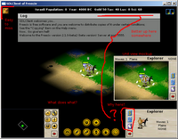
Also I think it's time to realise that moving the entire view for automatically moving units is 1) disorientating 2) annoying and 3) distracting. Either reset the view back to where it was before the automatic unit movement [since that's where I wanted to be] or making a sub-window (transport tycoon style) showing the currently active unit. Here's a mockup, with a few other peeves highlighted:
One of the most annoying problems was the UI moving the mouse cursor - often it was impossible to select units or cities because moving the mouse over them made it jump somewhere else.
Another glaring problem is the one highlighted in a previous blog on Freeciv - the lack of notifications to speed up multiplayer games really impacts single player games. I built two wonders but was never told about it - I only found out by spotting one city building city walls (I never do) and another on coinage.
I could go on [this all came from only 30 minutes of play] but, like I originally pointed out, this is a beta. If you want something reliable then stick with Freeciv 2.0.x for now. However, this is shaping up as a very nice game with good graphics that make Freeciv 2.0.x/1.x look incredibly dated. I look forward to the final 2.1 release although I don't expect it in 2006 on the evidence of this beta.


No comments:
Post a Comment